Our First Flip: Before
It’s hard to believe it was already 5 years ago that we flipped our first house. Sometimes it feels like it was just yesterday.
Since we bought the home without it ever going on the market, we unfortunately don’t have any nicely staged listing photos comparable to the photos in our “after” tour – and the power was turned off when we did a lot of our before walkthroughs, so bear with us on the photo quality. Personally, I feel it really adds to the dramatic transformation but photo quality aside, you can still definitely get the idea of the rough shape it was in when we snagged her!
You’ll notice some random stuff throughout the house in these before photos – there was a fair amount of stuff left in the house from the previous tenant we had to deal with, in addition to the updates we wanted to do to the house itself. Among what was left, was a queen size mattress, a desk, a huge rolling box TV that was about as tall as we are and a shed in the backyard full of miscellaneous stuff (plus a bunch of other stuff).
Front Exterior
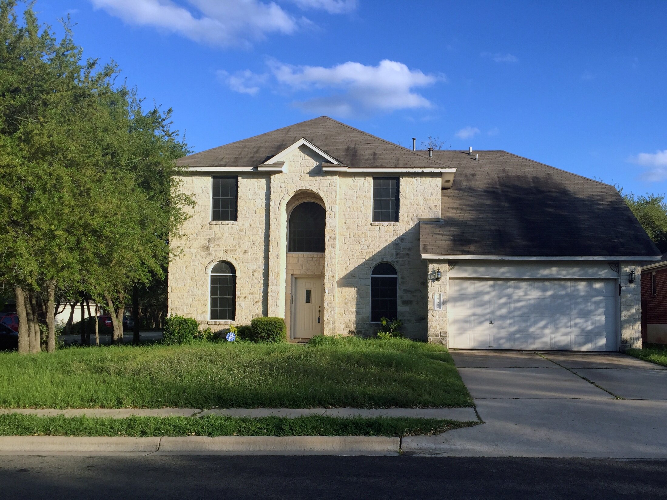
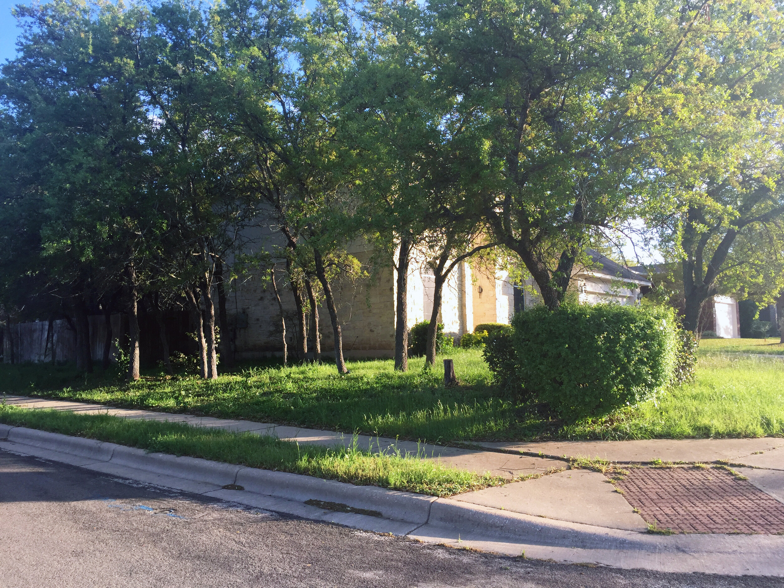
Out front we knew the yard needed some love – first and foremost to just mow the grass, but also a good tree trimming with some that were being choked out by others or growing into the fence being removed entirely. The roof was old, stained and leaking in some spots and needed to be replaced.
Exterior Detail
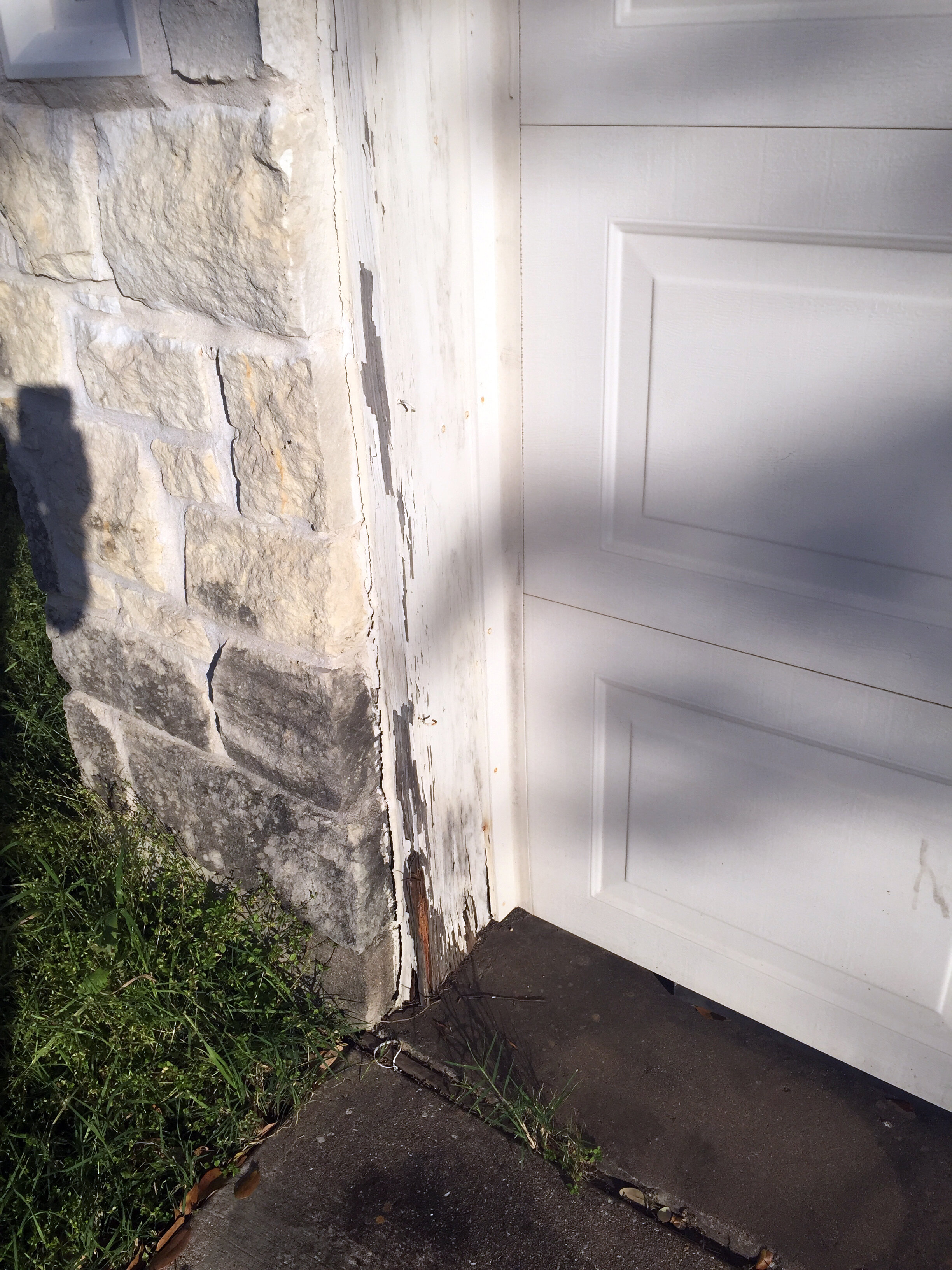
The 3-sided limestone was beautiful, but but dirty in some places, and the wooden trim paint was flaking off, requiring some boards that had rotten from prolonged water exposure to be replaced.
Exterior Detail
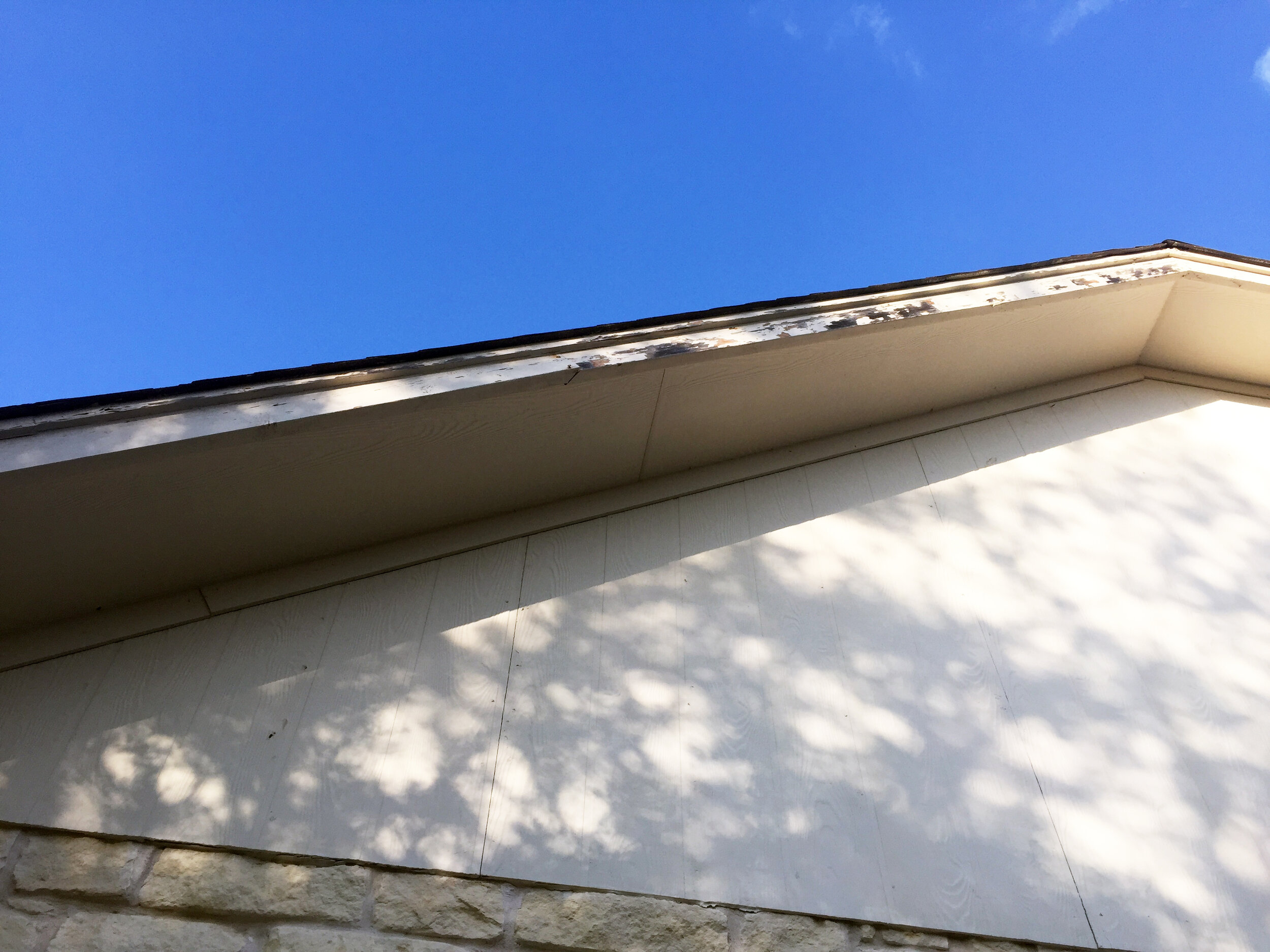
In addition to an overall paint job, some areas of the fascia needed more work than others.
Front Exterior
A good size corner lot, the view of the house from the main approach left much to be desired. Mostly full of scraggly oak trees, we knew we’d need to clean them up to really let the property shine, and to be able to see the house!
Dining Room
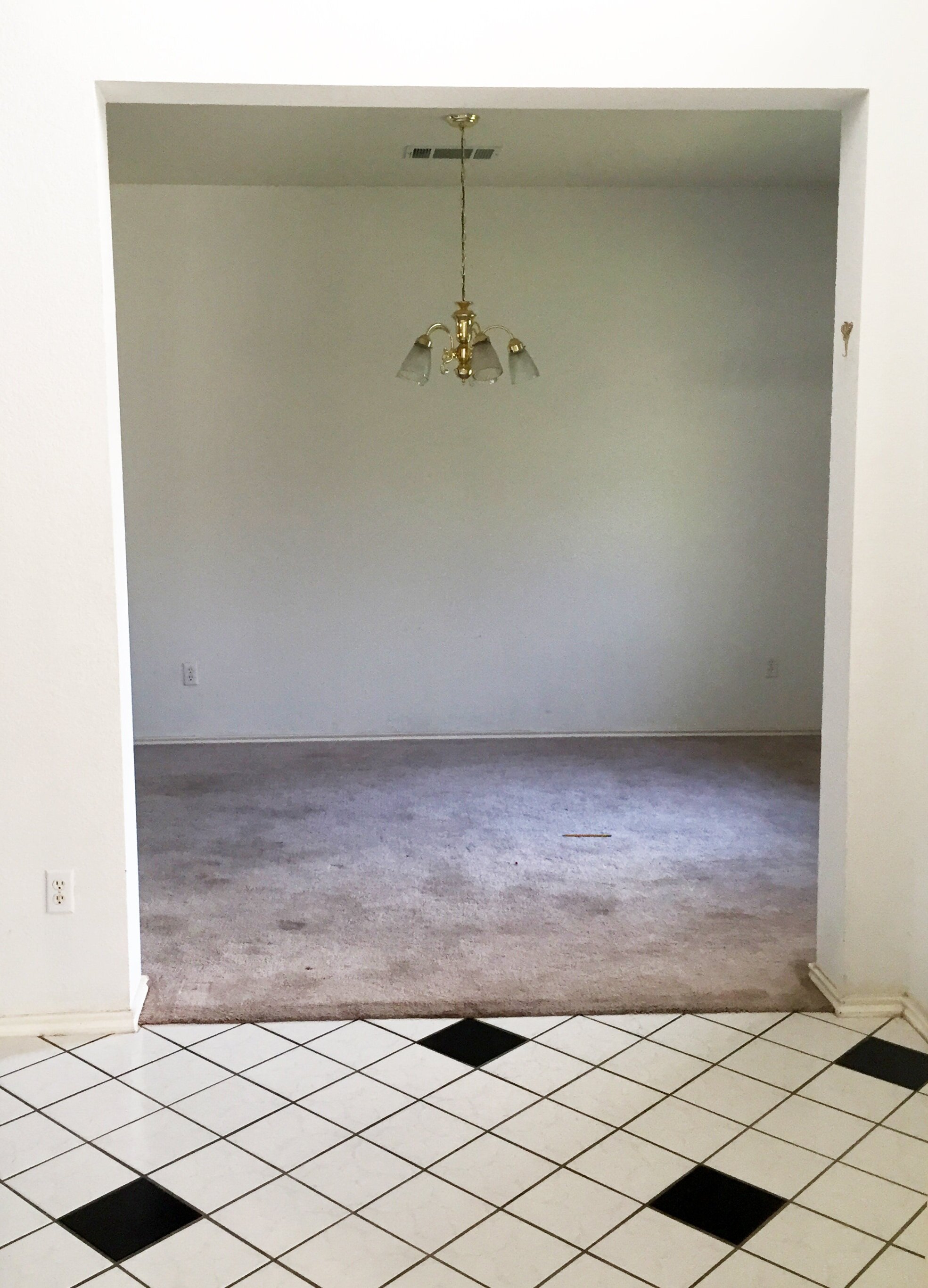
View from the entry. Right off the black and white tiled entry, the dining room had old carpet, dirty walls and a dated 90s brass chandelier.
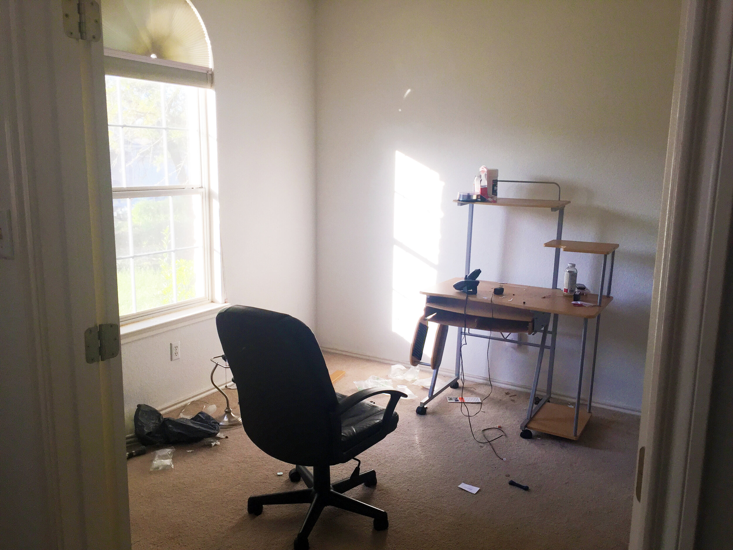
Office
Across from the dining room, the office had the same dingy carpet and worn walls, plus a dated window screen and a lot of “stuff” left behind by the previous tenant.
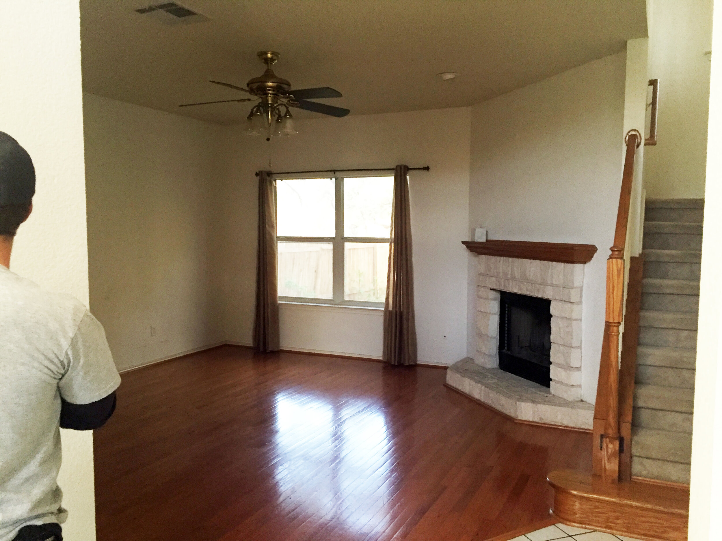
Living Room
View from the entry. This was the only room in the house that had these glossy orange-toned wood floors and the large, low-hanging fan, dingy walls and squatty curtains made the 8-foot-ceiling feel extra low in this room. The wood mantel was the same orange-y oak and made the fireplace feel dated.
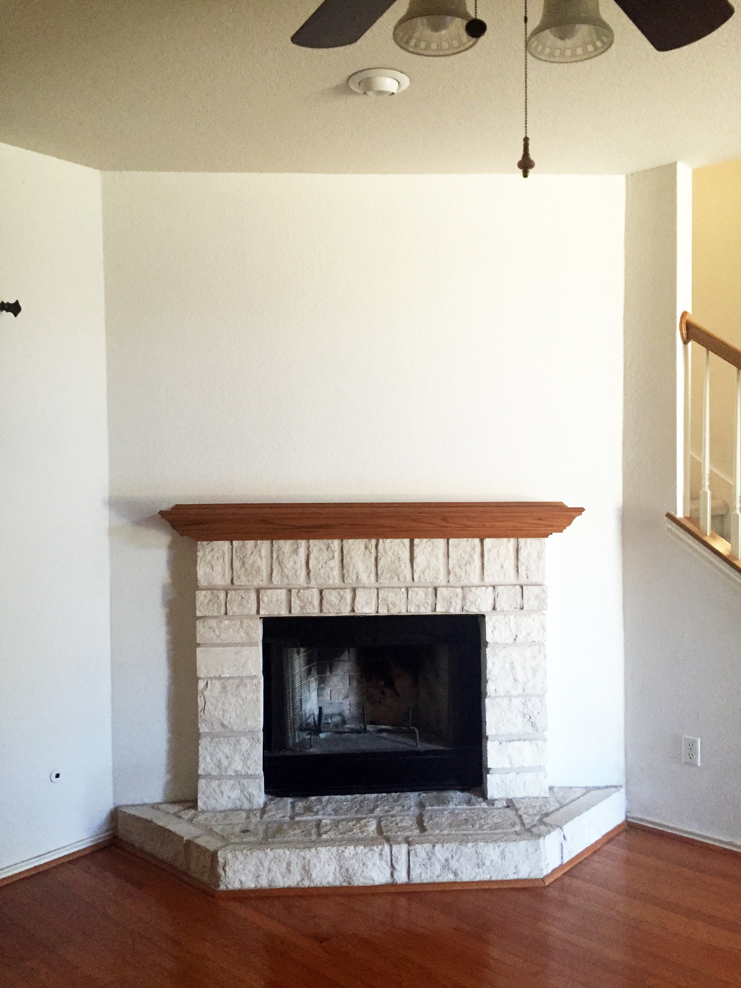
Living Room
View from the corner of the living room. While the limestone and fireplace insert were just a little dirty, the orange-tinted red oak mantel was in great shape but made the fireplace feel dated.
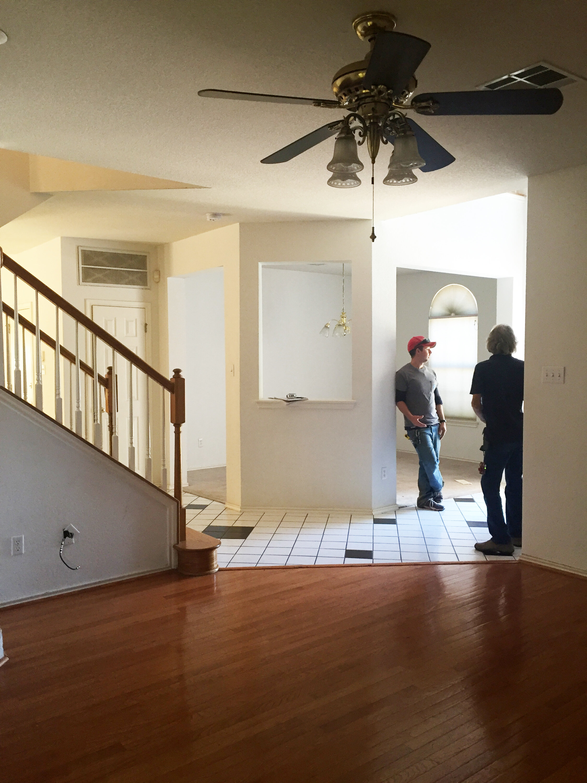
Living Room
View from the back of the living room into the dining and entry areas. From this angle, you can really see how chopped up the flooring was on the first floor, making the whole downstairs feels smaller and more segmented than it really was.

Kitchen
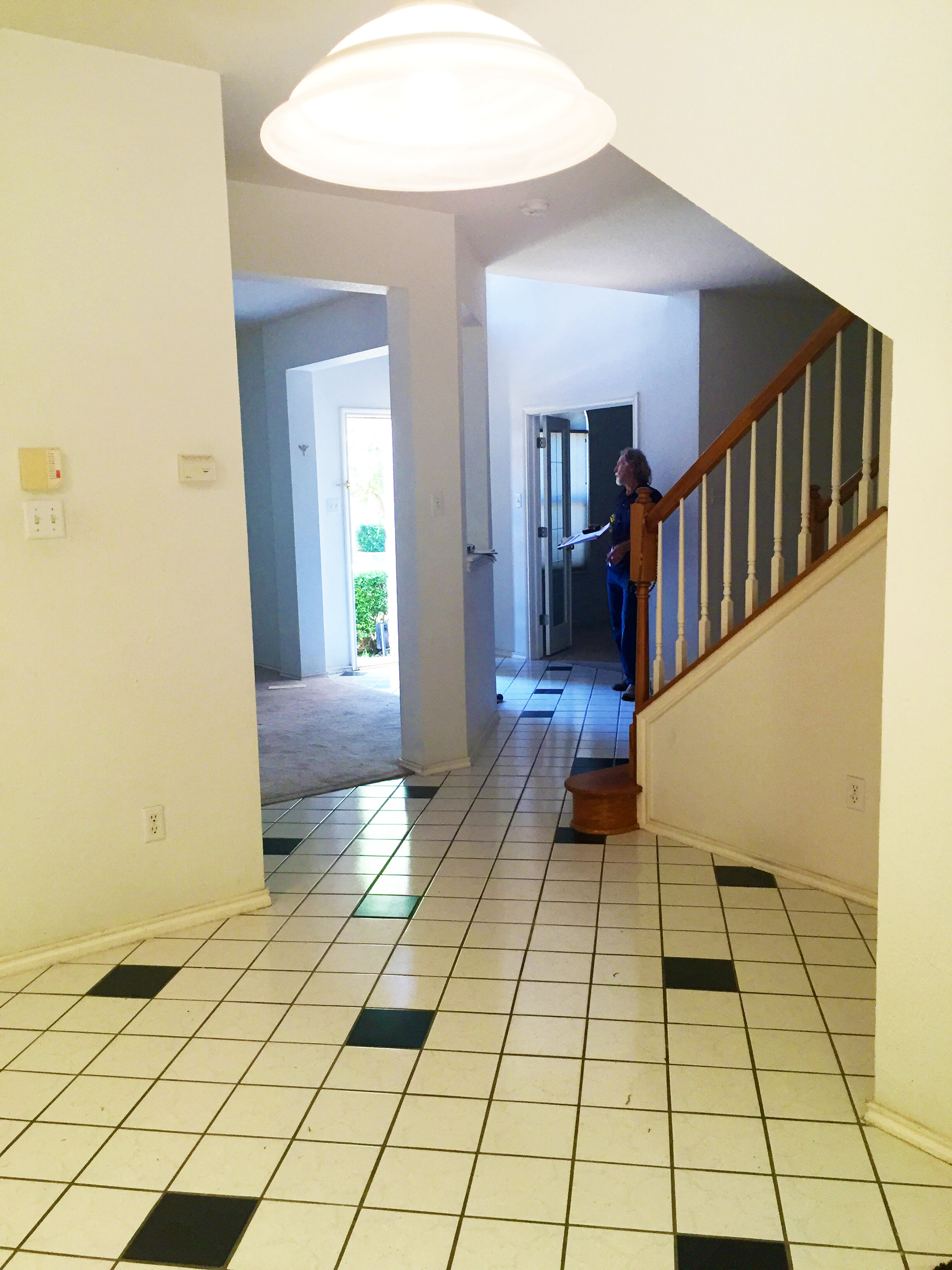
View from the base of the stairs/dining room. The black and white tile from the entry continued through the middle of the house and into the kitchen. The kitchen had a small nook underneath the stairs and a space for an eat-in table in front of the glass sliding doors that lead to the backyard.
Kitchen
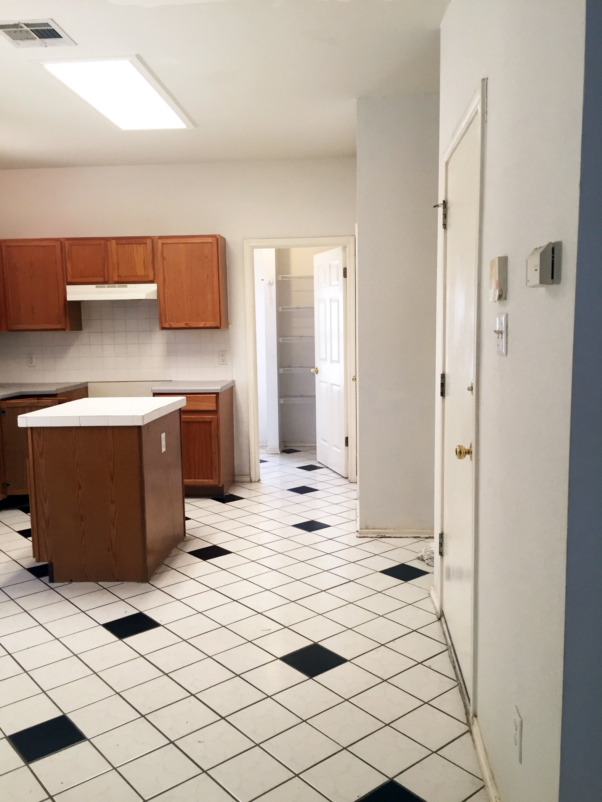
View from the base of the stairs. The kitchen had a walk space down the righthand side that needed to be kept in order to access the garage, powder bathroom on the right, and the large combination laundry room and pantry on the end.
Kitchen
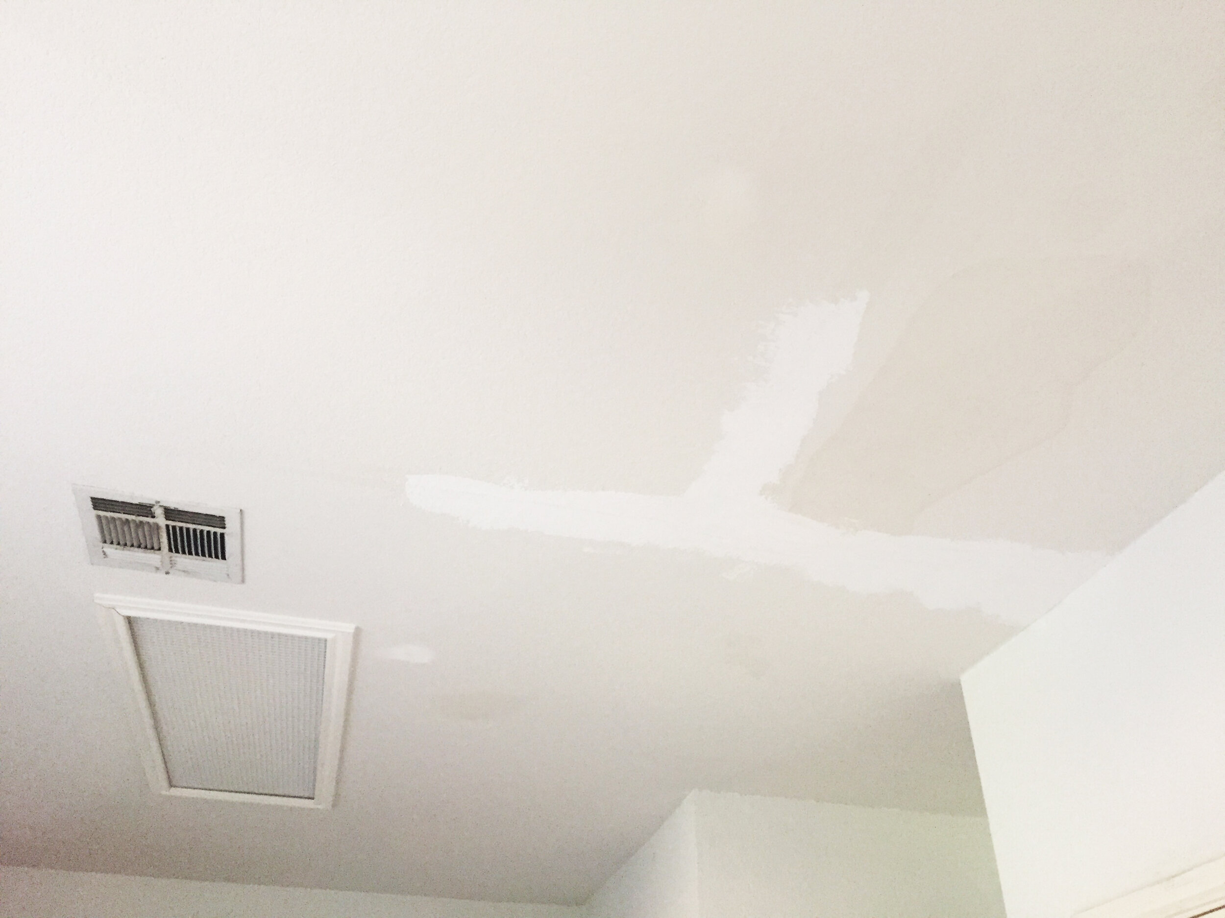
The ceiling in the kitchen had seen better days. There was an obvious leak that had happened with an unattractive patch job, plus a 90s fluorescent box light – both had to go.

Kitchen
View from the back door. The kitchen had a good footprint overall, but just needed a floor to ceiling makeover to bring into this decade.
Kitchen
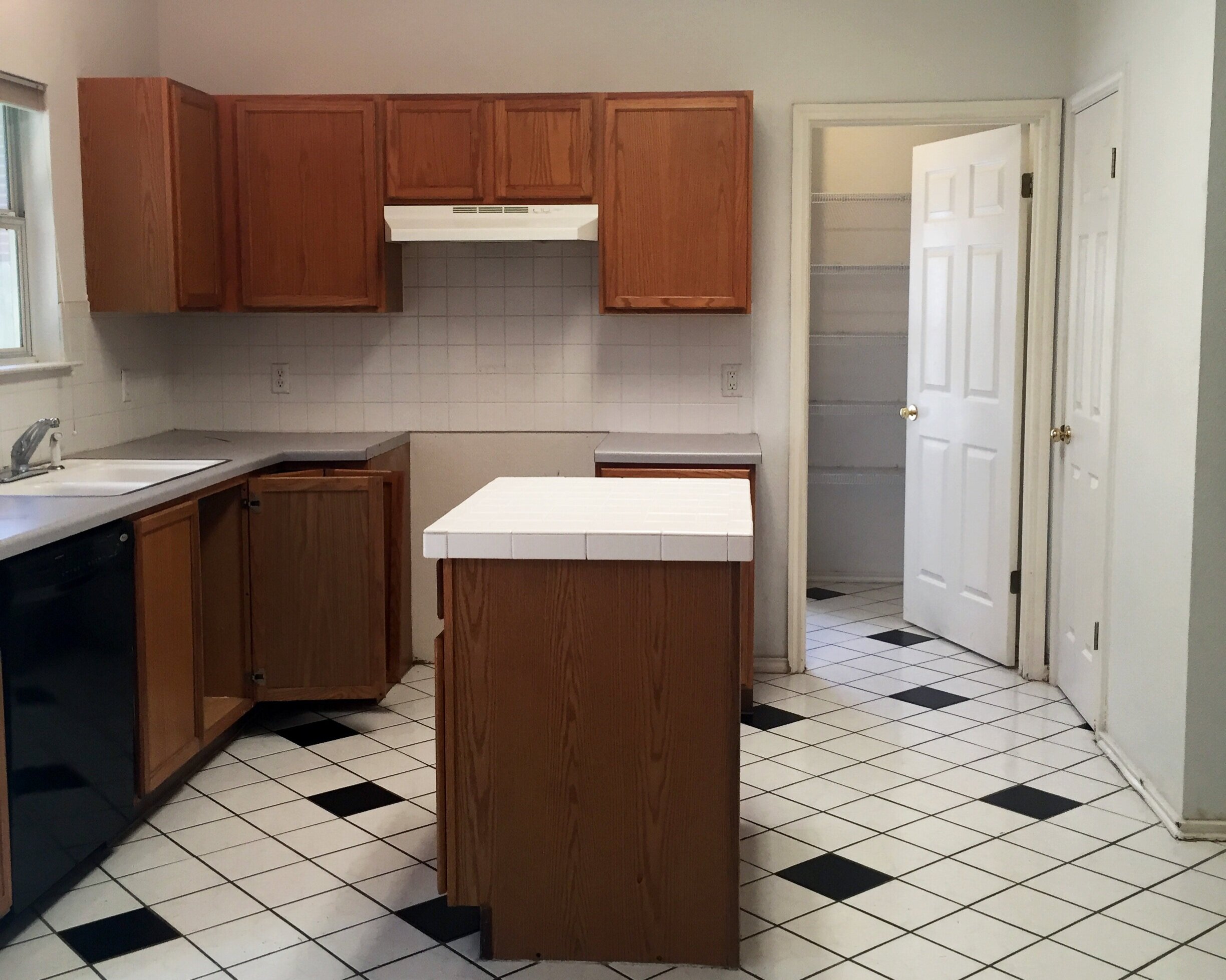
View from the eat-in kitchen area. Taking the tile to the ceiling helped make the space feel even taller.
Powder Bathroom
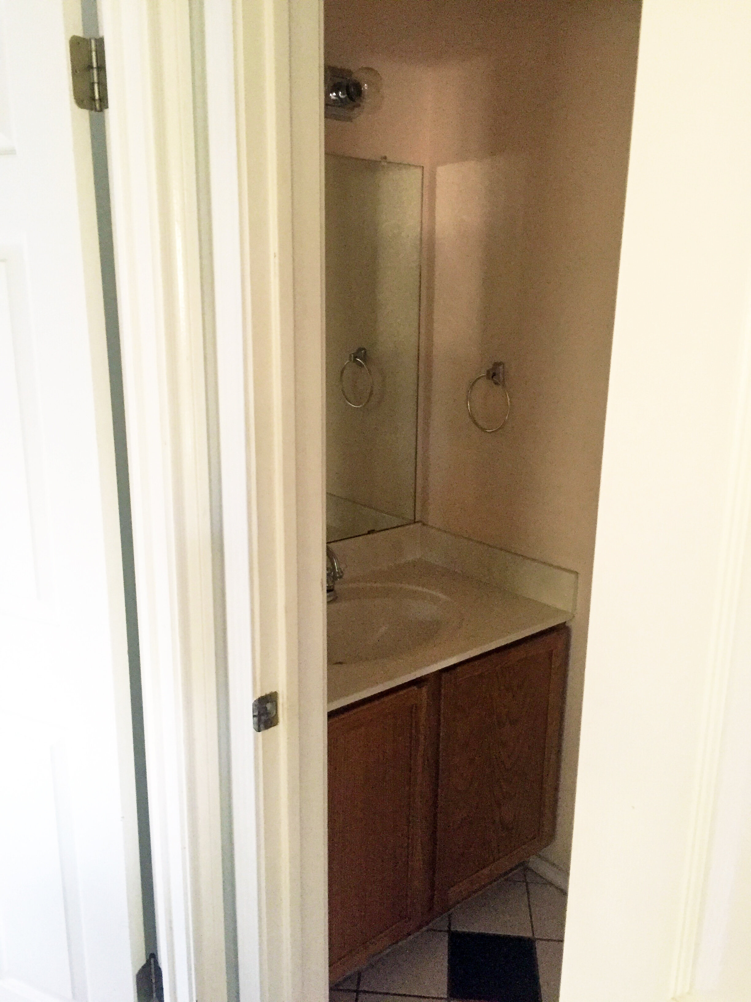
The small powder bathroom just off the kitchen had the same orange oak cabinets found in the kitchen, plus off white cultured marble counters and a large builder-grade frameless mirror. The bulky full cabinet made the space feel smaller than it was and paired with the light fixture made the space feel stuck in the 90s.
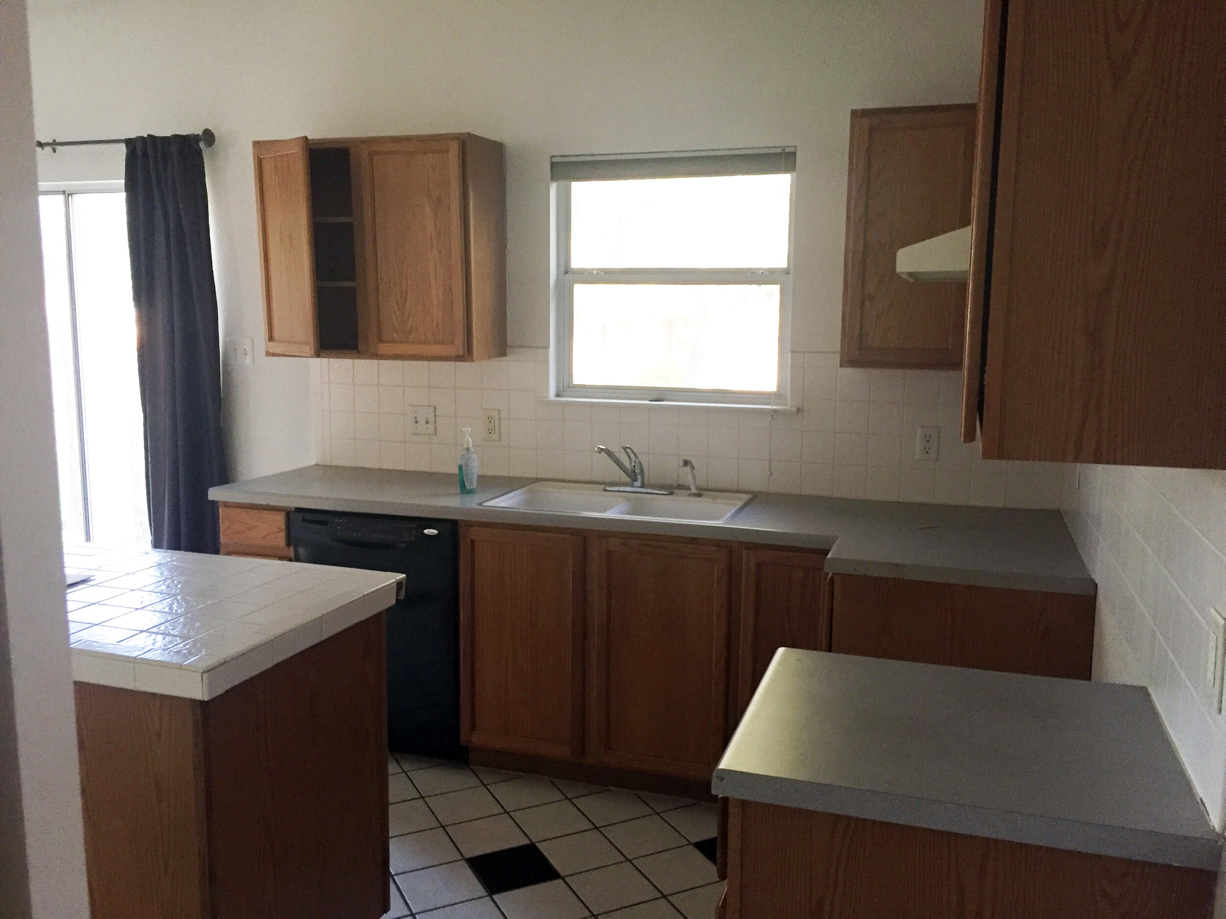
Kitchen
View from the powder bathroom/refrigerator/garage door wall. The kitchen had gray laminate countertops on the perimeter and cracked textured white tile island counter and backsplash. The faucet was short and didn’t work the best. The kitchen cabinets were solid oak and were in great shape, but combined with everything made the kitchen just feel dirty and outdated.
Kitchen
View from the kitchen sink/sliding back door. We knew the nook under the stairs was bonus space that could be utilized to extend the kitchen space.
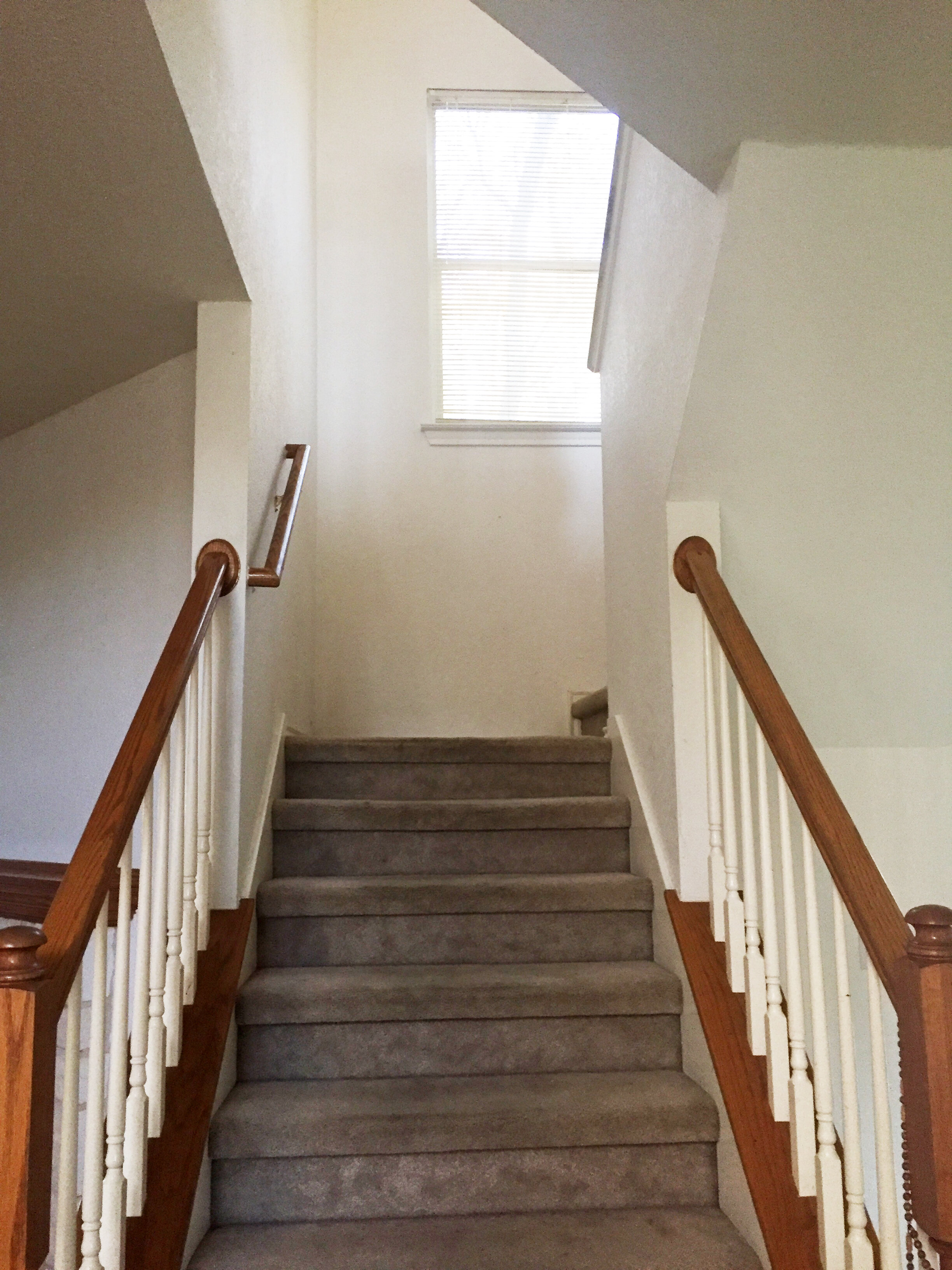
Stairs
View from the entry/base of the stairs. The carpet on the stairs were in surprisingly great shape relative to the stains in the dining room and office, and the banister had was the same orange oak found throughout the rest of the first floor.
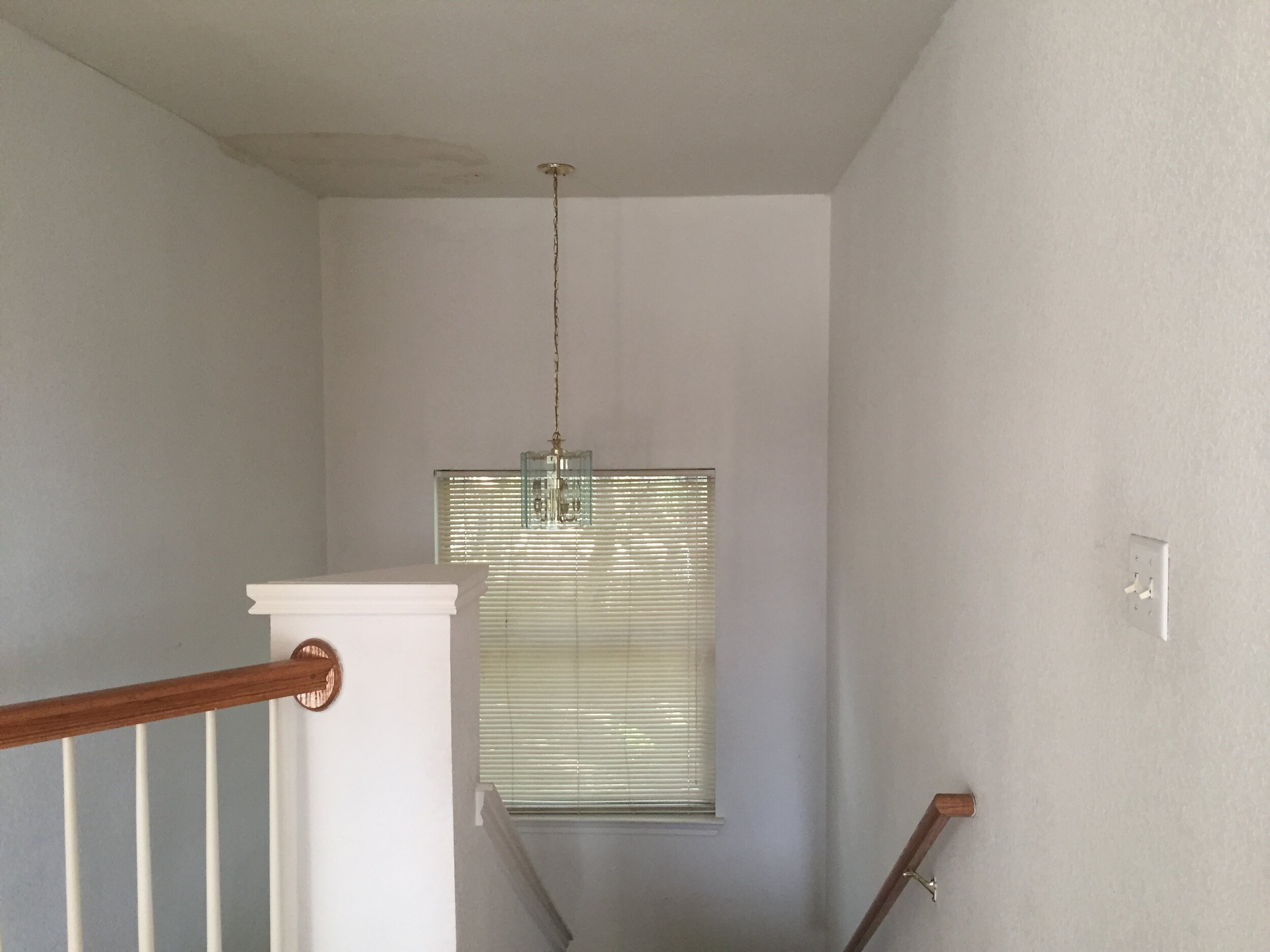
Stairs
The staircase was in great shape structurally, but the light fixture above the landing screamed “1990s” and the ceiling next to it showed evidence of a leak from the old roof that needed to be replaced and repaired.

Game Room
At the top of the stairs, you enter the game room that overlooks the entry on the right. The hall on the left goes to the main bedroom, and the hall on the right leads to two guest bedrooms and a guest bathroom. The main space up here was in good shape overall and just needed a mini makeover.

Main Bedroom
View from the bedroom door. This room was huge and had a mysterious red (slushie?) stain on the main wall, the carpet and the ceiling! It was a great size and shape and just needed some light love.
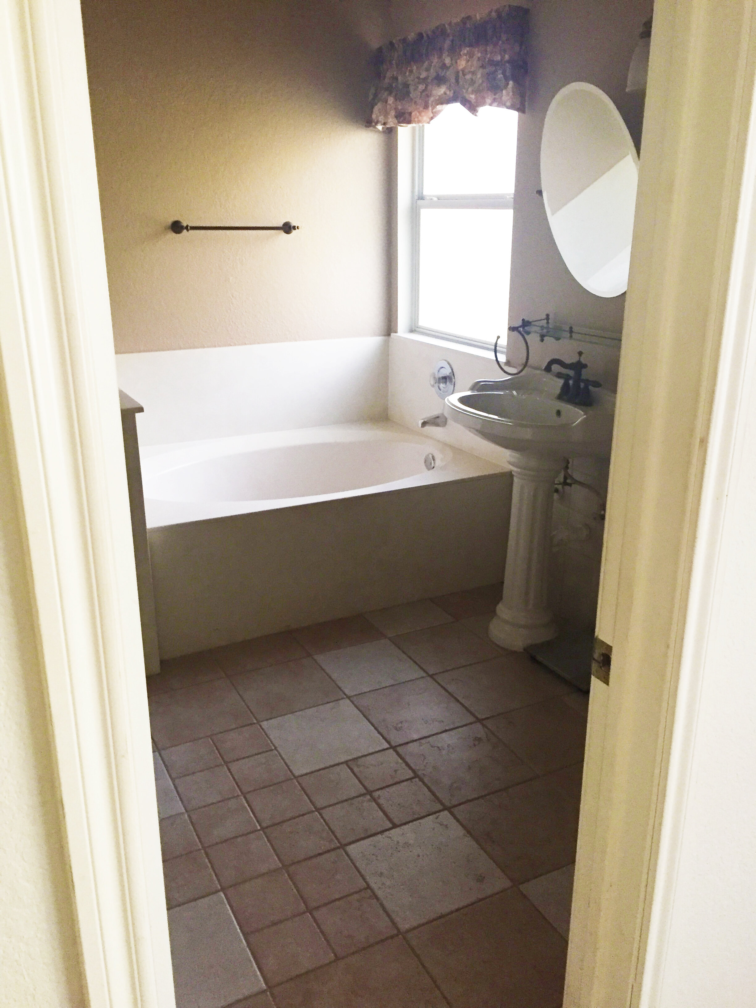
Main Bathroom
This room was rough. It had a deep garden tub made of off-white cultured marble with chrome fixtures, and two white ceramic pedestal sinks with oil rubbed bronze accented accessories. Not only did it have fixtures, finishes and a sandy/peachy color scheme that made the whole space feel dated, it also – more importantly – was lacking storage and function and felt off balance.
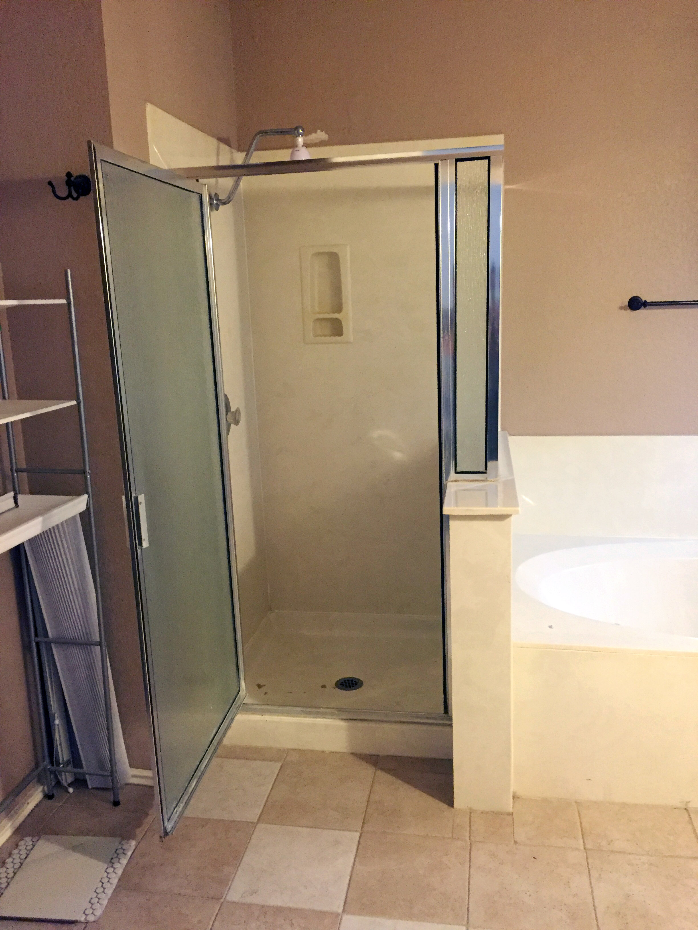
Main Bathroom
To the left of the garden tub was a standup shower surround that had a door that didn’t seal great and was allowing water to leak out onto the floor, causing water damage to the baseboards (hidden behind the open door in this photo) and surrounding area.
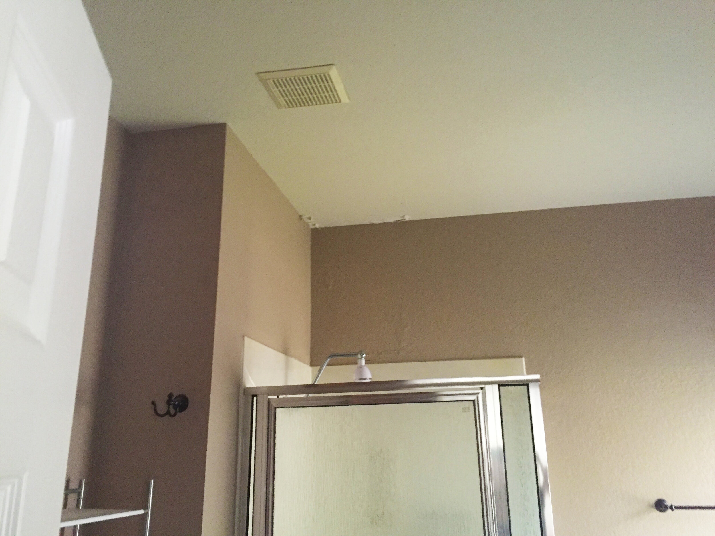
Main Bathroom
Above the shower, the ceiling had superficial signs of water damage from shower steam.
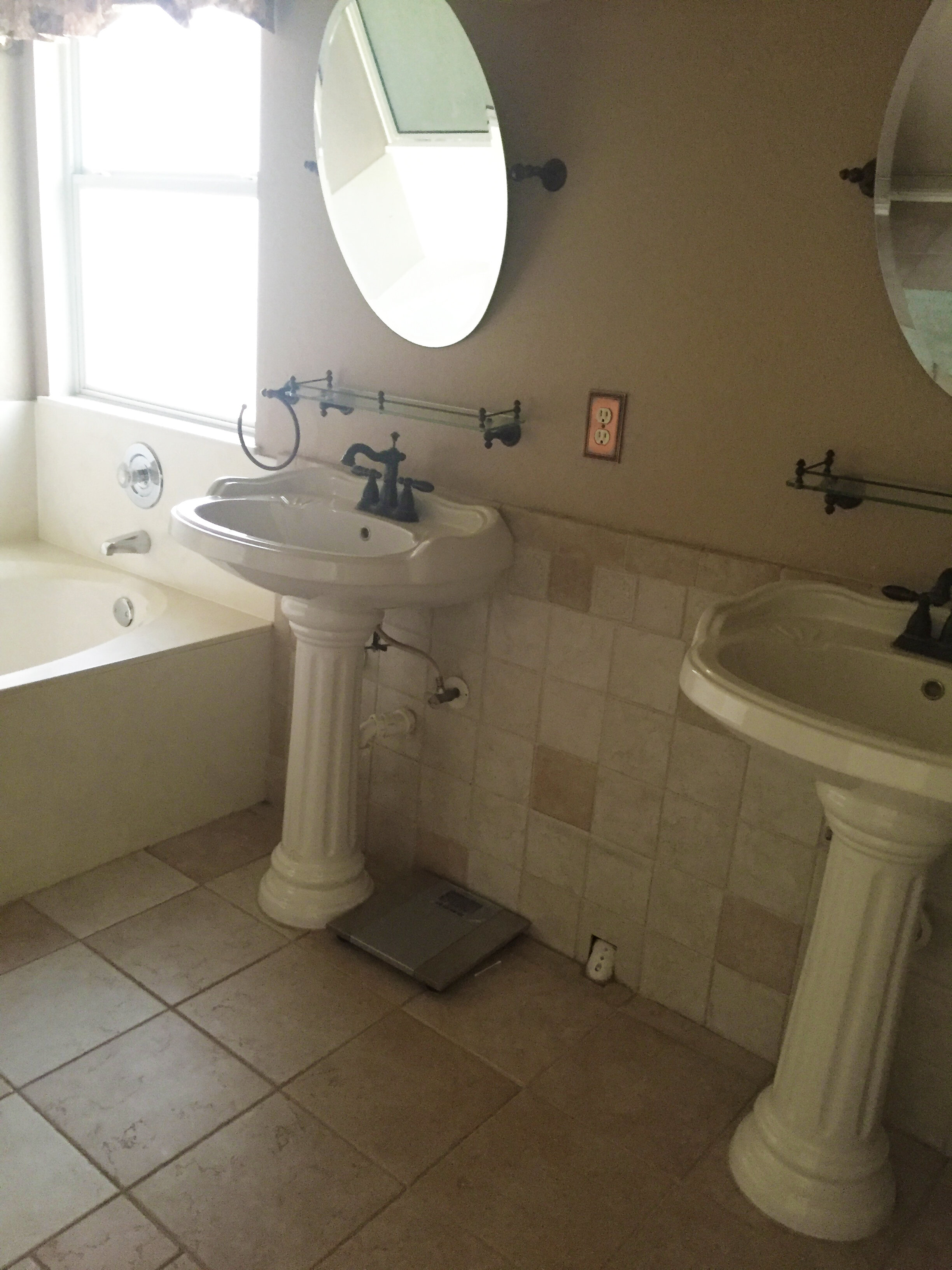
Main Bathroom
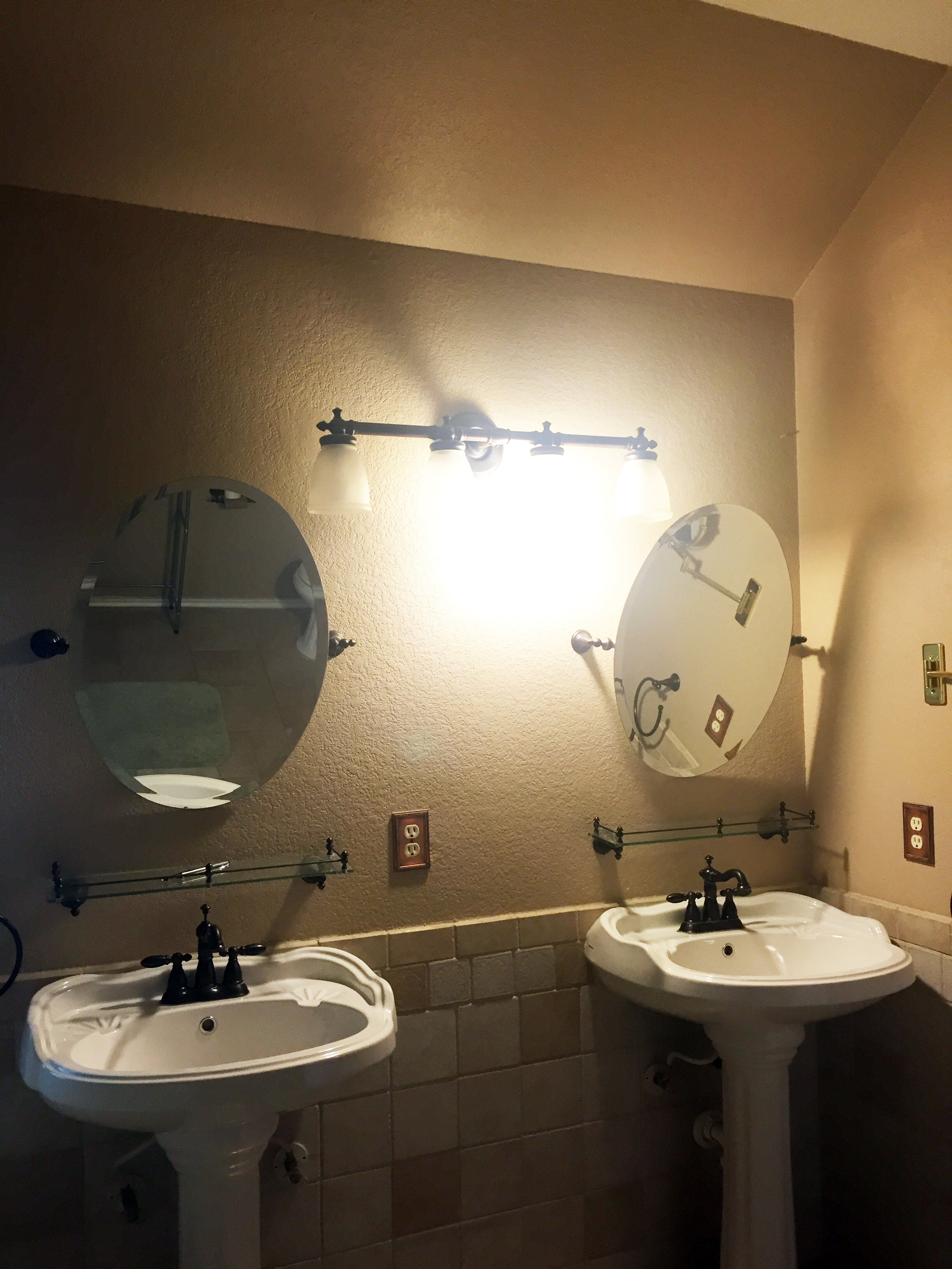
The single pedestal sinks felt disproportionate to the size of the bathroom – and left a PVC pipe exposed on the floor where it met the wall.
Main Bathroom
In addition to lack of storage, perhaps the worst things about the two-pedestal sink situation was that the support hardware holding the mirrors were not installed tight enough for the mirrors to be adjusted to any other angle than down so far that the the bottom of the oval mirror rested on the wall, and the small glass shelves under each mirror weren’t screwed into anything structural so they couldn’t hold any weight and were just there for show.
Guest Bedroom 1
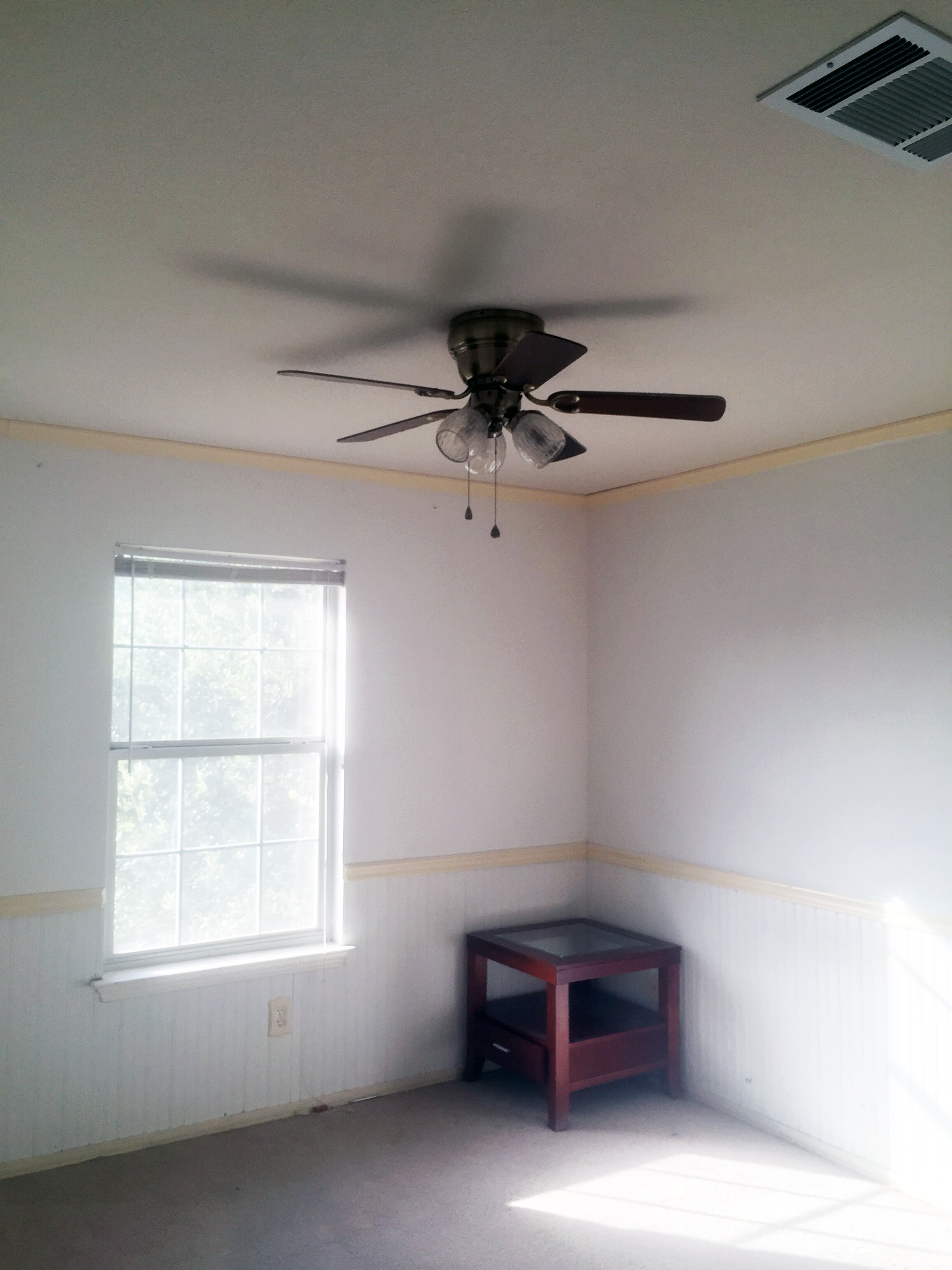
This room had good bones and from a distance was in great shape. On closer inspection the wainscoting needed some love to fill gaps and cracks in the beadboard and trim, the outlet covers needed to be swapped out for more modern versions, the carpet needed to be replaced, the fan could be updated to look more modern and the room needed a fresh coat of paint.

Guest Bedroom 2
This bedroom was probably in the best shape of any in the whole house and only needed to have the carpet updated and walls painted.
Guest Bathroom
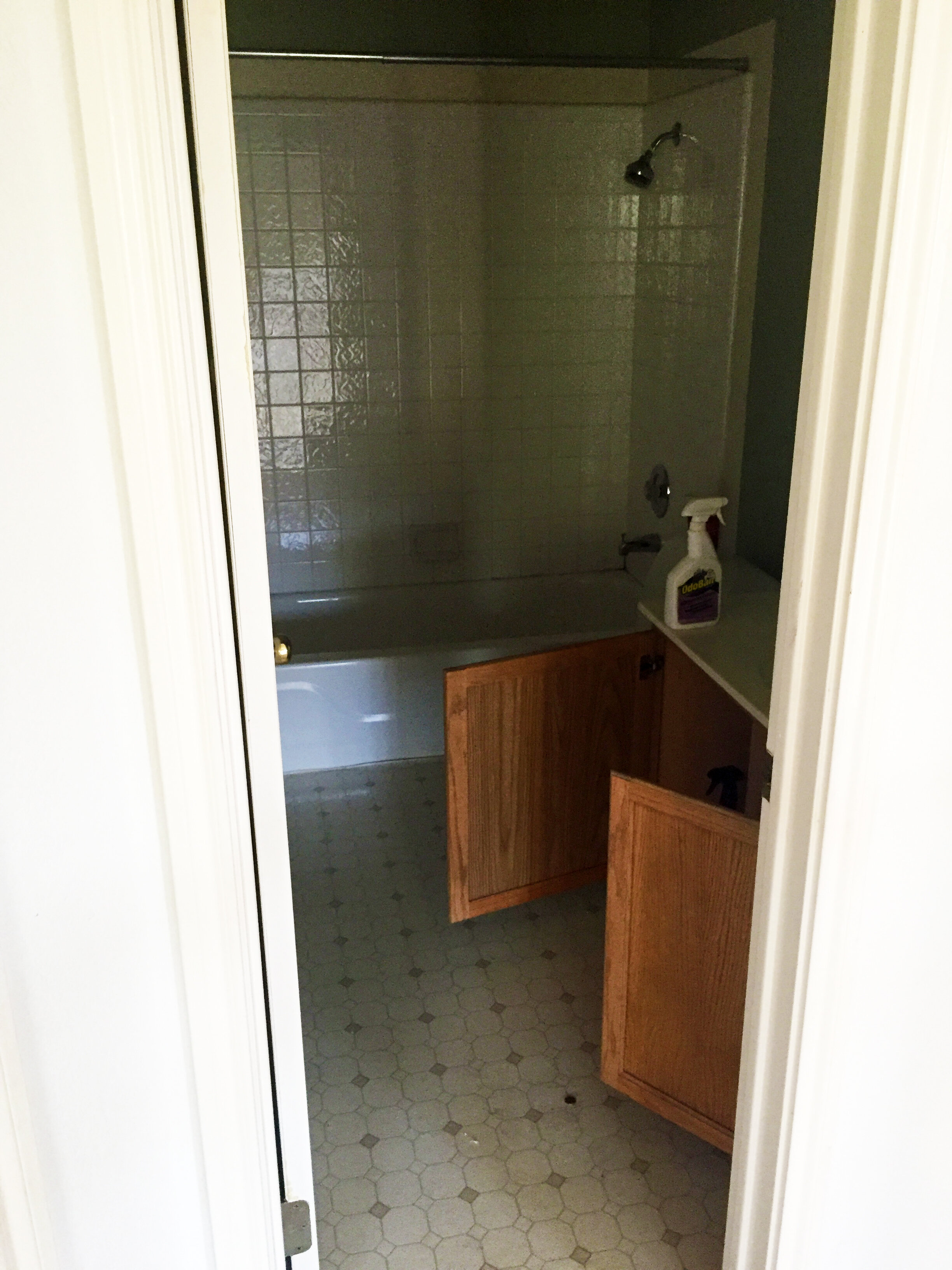
This room had a nice layout that worked well to serve the needs of the two nearby upstairs guest bedrooms. It had linoleum sheet flooring that was peeling up around the bathtub from moisture, a shower/tub combo that was in good shape overall and an orange-toned built-in oak cabinet vanity.
Guest Bathroom
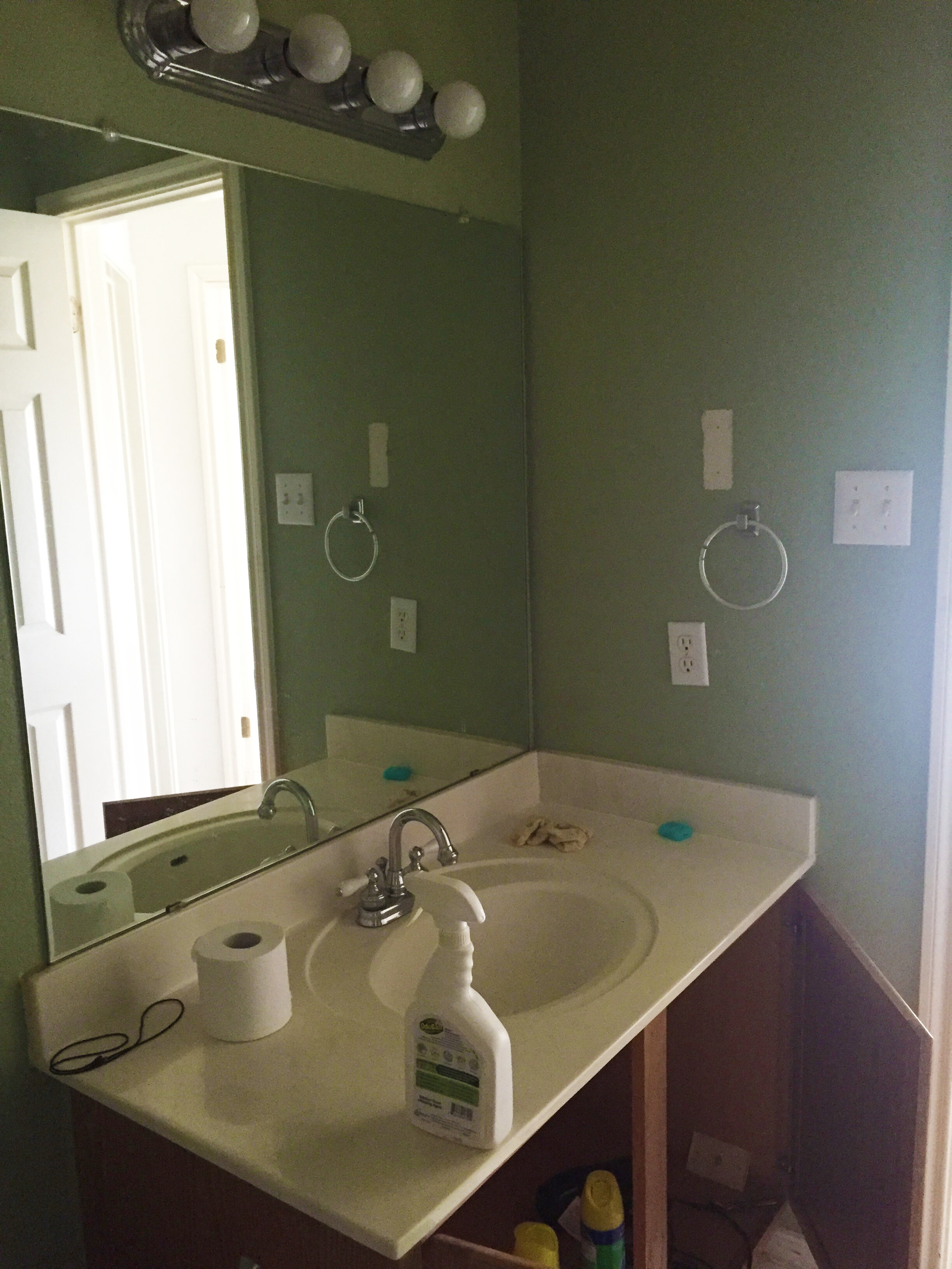
The orange-toned oak built-in cabinet vanity had a cultured marble counter and was in great shape that we were able to repurpose. Above it, hung a large builder-grade mirror attached to the wall with clips and dated 4-bulb wall-mounted light fixture.

Backyard
The backyard needed some love but was a pretty good size and had some great bones. Overall it needed a good trimming and freshening of the plants and there was a dilapidated trampoline that needed to be removed.
Backyard
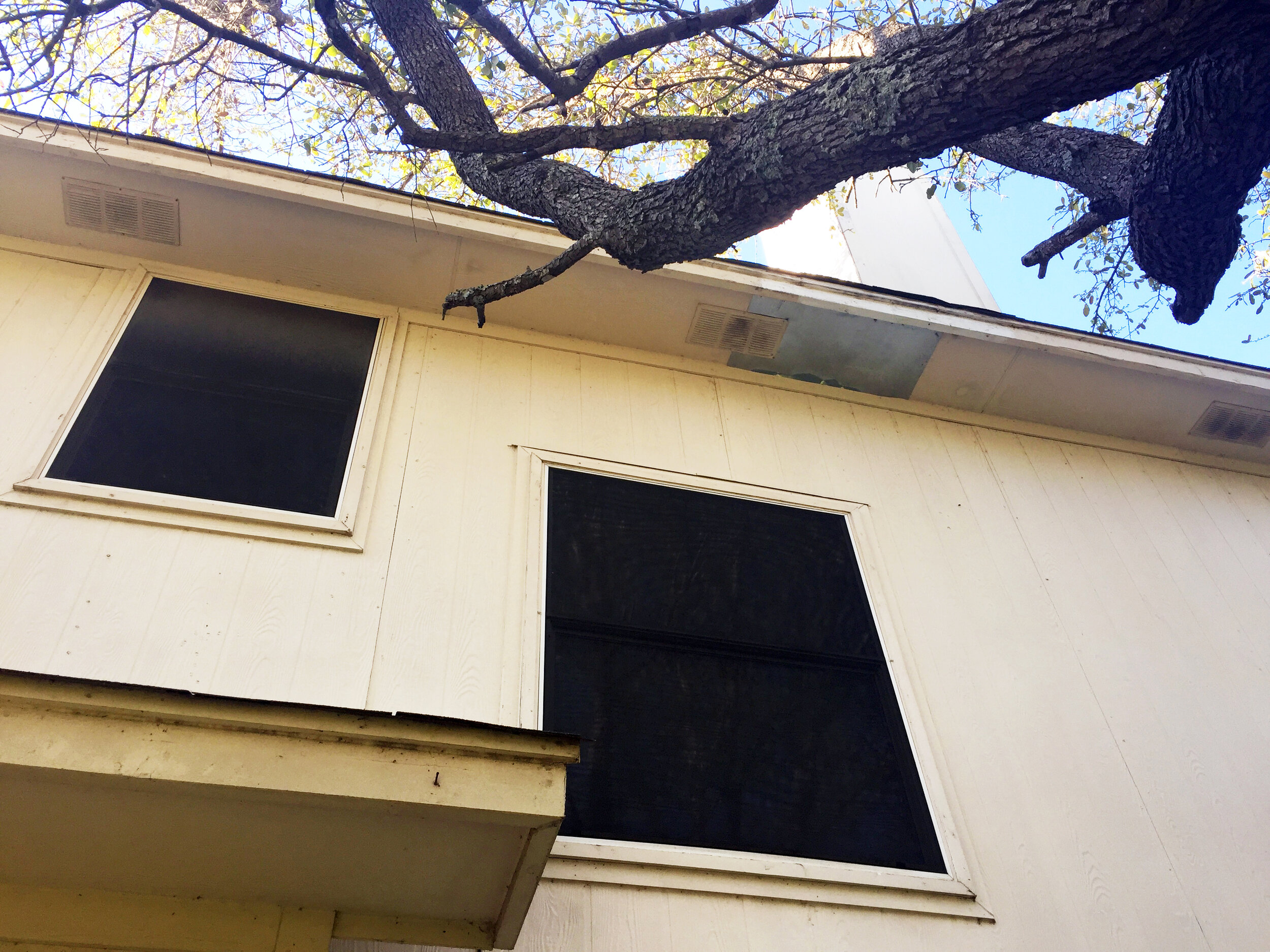
In addition to the backyard landscaping, the house exterior needed new paint and better repair work under the soffit (where the raccoon got into the attic!) as well as some repairs to some of the lower siding.
Backyard/Side yard
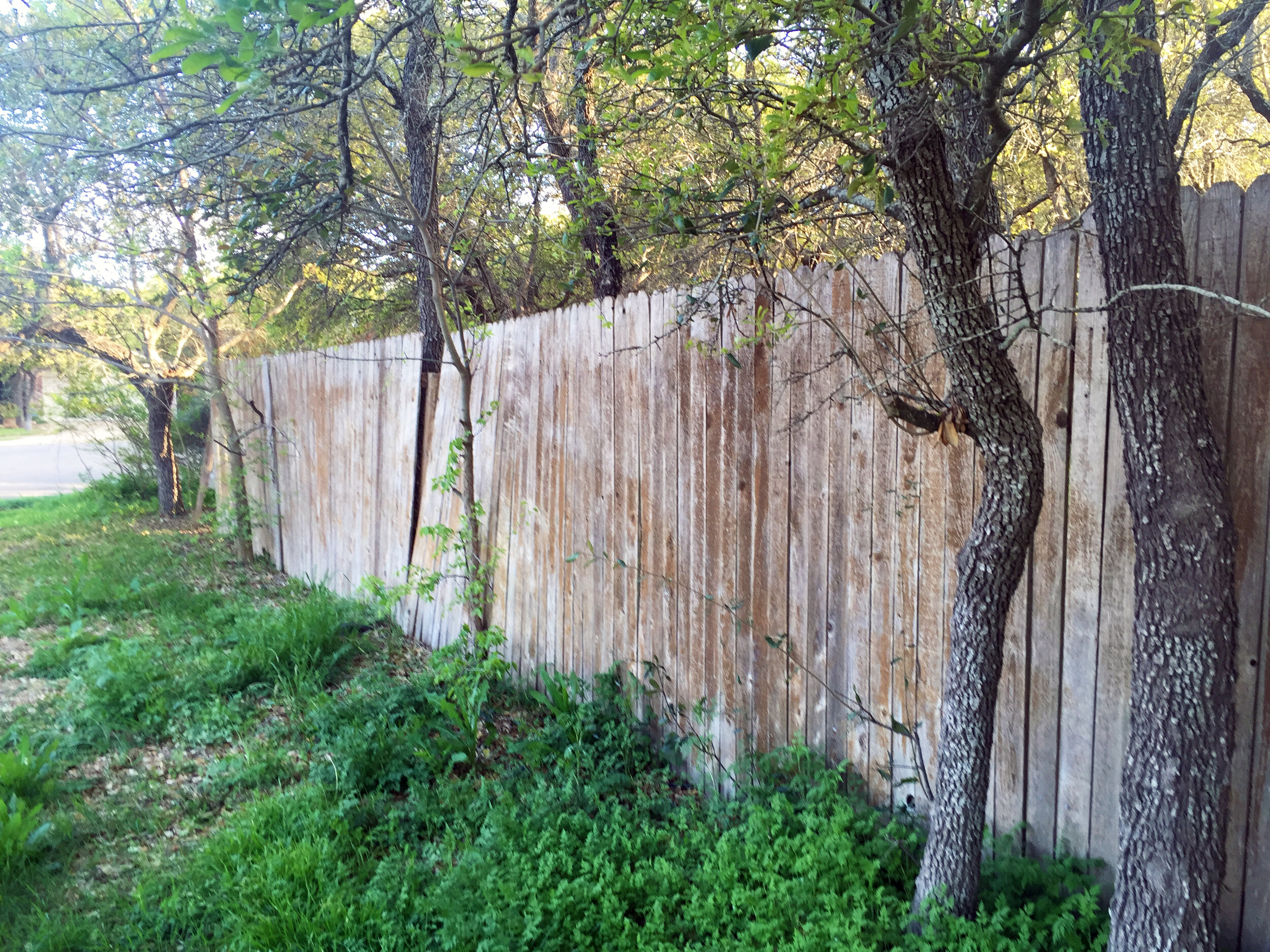
The fence on the long exterior corner edge of the property was in really rough shape with trees growing on/through it and needed to be rebuilt. We also knew we needed to clean the trees up and remove some of the “volunteer” trees that had been planted along the fence by birds.
While it wasn’t in totally awful shape, it definitely needed some love and work well beyond bringing it up to date.
If you haven’t already, check out the after tour here to see what we did to each space!

