Evolution of the Dining Room
All projects are not created equal. Some are fast and furious and might take a big budget to create a complete transformation in just a short amount of time. Some are slower to finish and come about over months (or maybe years) of making small changes and improvements here and there. Each can be amazing and end with incredible results. Today we’re talking about what I think most folks out there do – the small, but impactful, changes that help turn a house into a home.
Recently I was taking a look at some old photos and it hit me just how much we’ve really done to our house over the past nine years. It was kind of a surprise to me to actually see laid out back to back to back, and I thought it would be fun to share with you how our dining room has evolved (so far) since we’ve lived here.
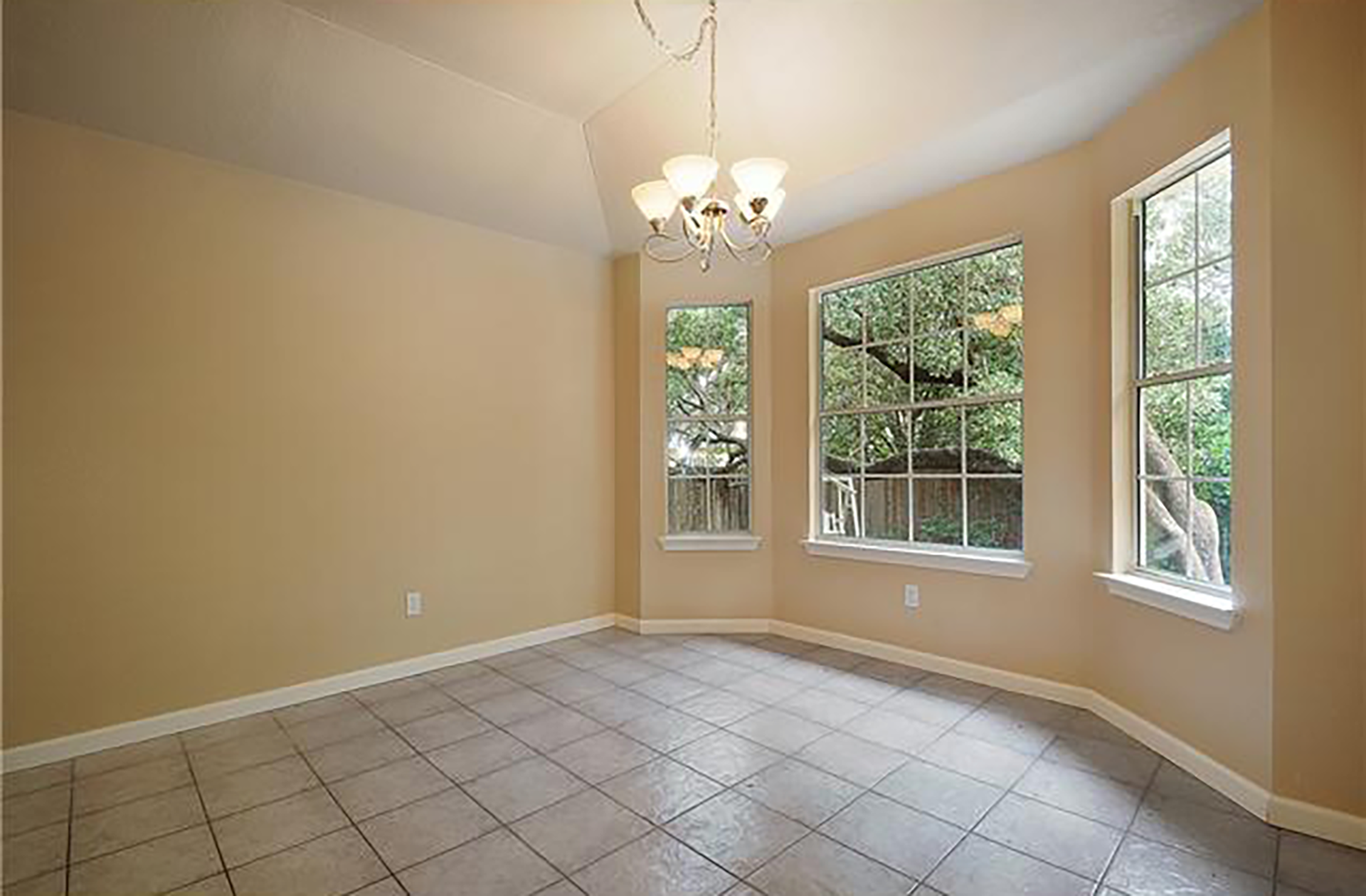
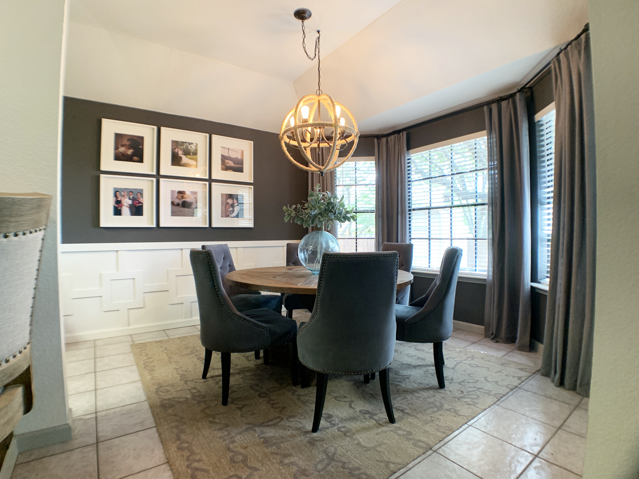
You might already be familiar with our “before”, and our “right now”:
But you haven’t seen the in between and it’s been a journey getting from there to where it is today.
I love a dramatic before and after as much as the next gal, but there’s something about a space changing over time and growing with you and your family that I really appreciate and value. Something I hear / the vibe I get from a lot of folks (my internal self included!) is the pressure to design and do everything big and bold and “right” the first time and in one fell swoop.
I want to dispel the idea that just because it’s not a floor to ceiling overhaul done by a professional designer and costing thousands of dollars doesn’t mean it’s not worth it or that it can’t be meaningful or a be a powerful transformation.
Let’s take a trip down memory lane and see just how by making small improvements here and there you can slowly get the space you want! Starting with…
Our 2012 dining room
We’d just bought the house here – it was empty, builder basic and very peach from head to toe.
It was move-in ready, but not exactly the vibe I was going for so we took a little time to make some changes before moving day…
Our first changes | 2012-2013
Before we moved in, we took the time to paint the entire house and make some changes (like painting all of our kitchen cabinets, replacing an old bathroom vanity and painting all of the walls and ceilings in the house) that would be easier before we had all of our stuff in it since we still had time on our apartment lease before we needed to be out. After move-in, we saved up to buy a nice rug to help ground the space and slate blue velvet dining chairs – both of which we still have today.
oUR FIRST PIECE OF FURNITURE | 2014
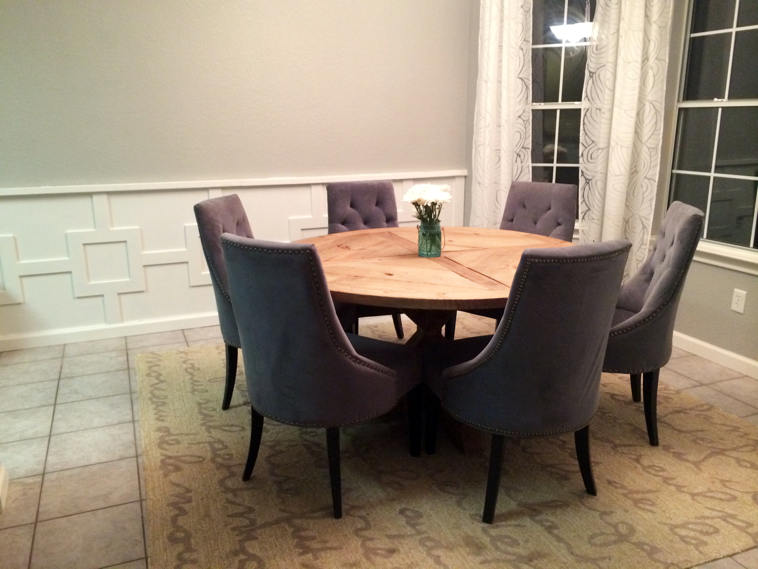
After a while using an old large desk we’d made out of galvanized pipe and pine boards, we decided to try our hand at making a solid, round dining table from scratch that better fit the shape of our dining room. We also hung up some white burnout curtains to help the space feel taller, brighter, and overall more finished and homey.
Modern squared wainscoting | 2014
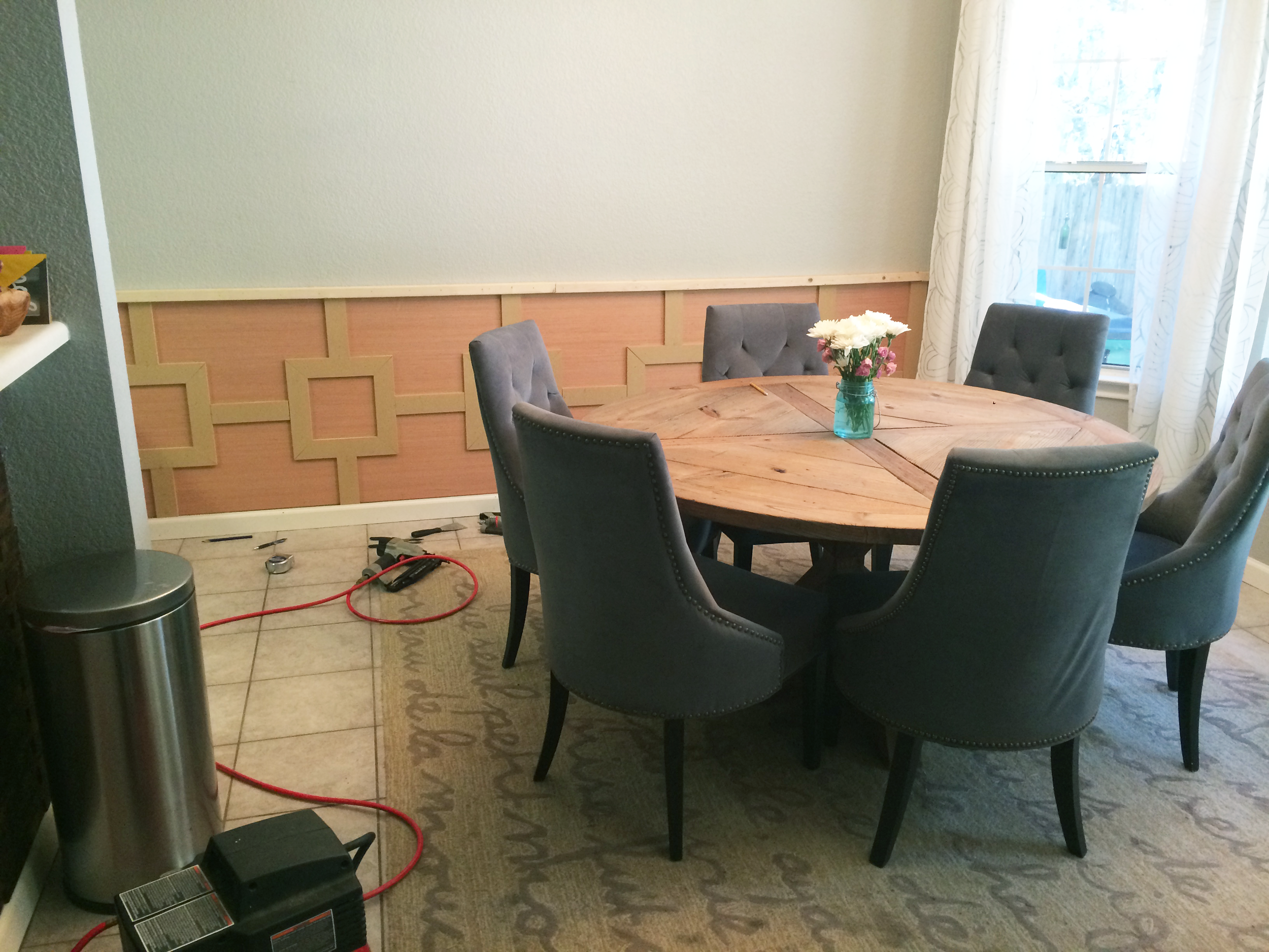
Because this room is square-ish / round-ish and we opted to make the biggest table possible (that seats 6 comfortably / 8 snuggly) we don’t have room for a storage cabinet or buffet along the wall. To add some interest and texture to the room and character to the home as a whole, we decided to add some modern wainscoting to the bottom half of the wall using a combo of plywood, MDF and whitewood trim. We painted it out a crisp clean white to match our baseboards and curtains and help brighten the room.
Photo gallery wall | 2014
With the wainscoting in place, we knew this wall was the perfect place to showcase some of our favorite photos. We hung large 23” square white frames that mimic the lines of the new wainscoting.
Chandelier Update | 2015
After years with our satin nickel light fixture, I gave it a makeover by removing the frosted swirly glass covers, using some oil rubbed bronze spray paint on the existing metal fixture and chain, and made the external globe from scratch using large embroidery hoops, rope from the hardware store and small wooden pieces to make the bottom finial. Using large, exposed Edison bulbs and centering it to the table by swagging it over with a new ceiling hook placement finished off the look and helped balance the light to the size of the table and room.
Charcoal walls | 2018
At some point I began to realize just how blue-tinted and cinderblock-y the medium grays I’d chosen (and painted the entire house) felt and looked for a replacement that made our home feel warmer (without going back to full-blown peach mode), more dramatic and interesting. I landed on Peppercorn by Sherwin Williams and have been in love with it ever since. It’s a beautiful dark gray that almost looks a little navy in certain lights. We also painted the ceilings a warm bright off-white (Behr’s Swiss Coffee) which helped the whole house feel cleaner, more modern and less like a large jail cell, and found a large clear vase for our year-round centerpiece.
It’s decorated for Christmas in the photo above, but you can see how the charcoal walls helped add some extra drama to the dining room and really helped our crisp white wainscoting pop.
Our dining room today | 2021
Since the previous photo, we’ve swapped out the white curtains for dark gray ones that are less sheer, kind of linen-feeling and match the living room, hanging them with black curtain rings, spray painted the existing white curtain rods and finials black, replaced our white painted wood window sills for Carrara marble, turned our white windows black and painted our baseboards (not on the white wainscoting wall) and window apron (the wooden piece under the sill) light gray (Sherwin Williams Mindful Gray).
Shop this room
Round Trestle Dining Table:
Our table is 58” in diameter and fits 6 comfortably, but can accommodate 8 (a little cozy) when we need to. For reference, I’ve included the number of people that can fit at each diameter table below.
We made ours from scratch ourselves, but here are some comparable alternatives:
Larger than ours – 72” round seats 10
About our size – 60” round seats 8 | 54” round seats 6
Sized somewhere in the middle – 48” round seats 4-6
Great for smaller spaces – 36” and 42” rounds seat 4 | 24 and 30” rounds seat 2
Chairs:
Ours are no longer sold, but here are some comparable alternatives:
Light fixture:
I made ours using the existing light fixture as a base, but here are some comparable alternatives:
Wood and Oil Rubbed Bronze Metal Globe Chandelier – (Comes in multiple sizes)
Curtains:
White Burnout Curtains – Ours are no longer available, but here are some comparable alternatives:
White and Silver Metallic Sheer Curtains – not burnout, but the geometric lines kind of mimic the line pattern on our old curtains
Gray Curtains – Ikea LENDA Curtains with tie-backs | 2 pairs
I carefully cut off the tabs on the top and used rings to hang them
White Curtain Rods (+ black spray paint) – OR – Already-Black Curtain Rods
White Finials (+ black spray paint) – OR – Already-Black Finials Alternative 1 and Already-Black Finials Alternative 2
French Poem Rug:
Ours is no longer available, but here are some comparable alternatives:
(Or you could even DIY your own meaningful poem or song lyrics with a neutral rug and some fabric paint / paint pens!)
Gallery frames:
Ours have been discontinued, but here is a comparable alternative:
Paint:
Charcoal Walls | Sherwin Williams Peppercorn in flat finish
White Wainscoting | Bright white paint in semi-gloss finish
Gray Trim | Sherwin Williams Mindful Gray in semi-gloss finish
Ceiling | Behr Swiss Coffee in flat finish – (I had Sherwin Williams color match Behr’s color Swiss Coffee since I love their paint so much!)
Christmastime White Faux Fur Chair Throws
So, are you more of a tortoise or a hare when it comes to projects? Does slow and steady win the race at your house, or are you more fast and furious?
We’d love hear how you improve your space in the comments below, and if you would like to see us share more on the evolution of individual spaces!
